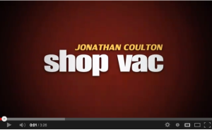
Suburban Boredom At It’s Finest

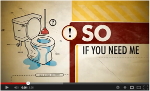
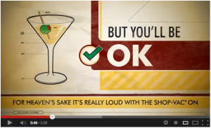
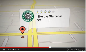
Such a clever Type in Motion piece and one of the more advanced ones that I’ve looked at. I’ve talked a lot about getting basic principles to work before jumping into more advanced forms of type in motion. I just love this video because it’s complicated and IT WORKS. There are tones of different typefaces, but they all have a purpose and effects although many are used for a REASON. They typefaces all mimic big box stores and familiar brand names, which is perfect for the subject matter because it’s about a couple who just go to live this boring suburban life. Letting consumerism and commercialism take over and playing off pop culture keeps the very busy video familiar and easy to follow. The viewer recognizes half the images already so we’re not processing new information. It just makes things much more interesting by using the same typefaces as the brands that he’s singing about in the music.

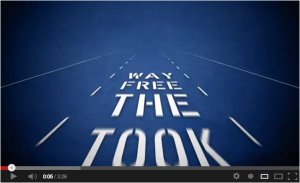
Adding in backgrounds can also be a BIG challenge especially working with so many styles of type and textures as you have in this video. Again, he’s done it in a very clever way. As well, he uses the background to create secondary imagery and animations turning the type on it’s own into other things such as a freeway sign rather than just free standing type. (0:09)

The Camera angles and motions are all very intuitive and work well with the beat of the music and the timing of the lyrics. Not easy to achieve. (0:06)

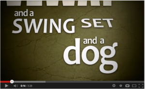
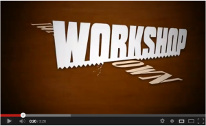
Two of my favourite sequences are at (0:13) and (0:21) simply because they are intuitive and the camera works at the right speed with the music to still be able to follow along. As well as the cropping and angles work really well.

The best part of the video in my opinion is the chorus, just because the animation and the type all work really well together with the timing of the music. Also the background, with the details of the coffee stain on the paper as if the husband was working away in the garage is just such a great detail. I think it’s also great that he repeats the sequence because there is a lot going on and it really let’s you appreciate all the interesting things that are happening in his video.

I just love it, possible my most favourite Type Video yet!
Shop Vac

Shop Vac

Screen Shot 2013-02-11 at 9.44.41 PM

Screen Shot 2013-02-11 at 9.45.07 PM

Screen Shot 2013-02-11 at 9.45.45 PM

Screen Shot 2013-02-11 at 9.46.11 PM

Screen Shot 2013-02-11 at 9.46.44 PM

Screen Shot 2013-02-11 at 9.48.04 PM

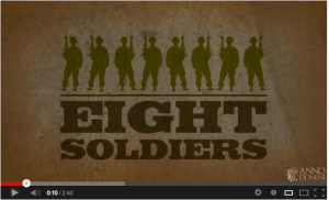
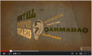
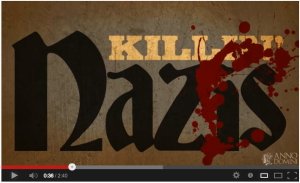
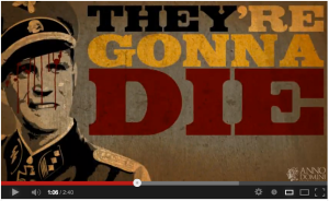
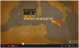
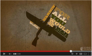
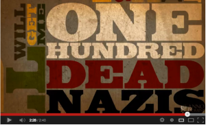
Inglourious Basterds Kinetic Typography

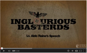
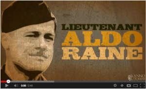
Another one of my favourite Kinetic Typography Videos. I really love the aesthetic of this video. It suites the subject matter. I also love the style of illustration, type and colour palet, all these elements are superb in this video. The illustration is used sparingly, and it’s placed only in sequences that enhance the type.

One of the strongest elements of this video is the timing to the sound. It is right on key with the type and animation movement. The camera angles are also done exceptionally well in 3D space(0:16) and the camera movements including the panning make the story stronger. It’s not overkill however, things are only placed in 3D space and in motion if it makes sense with the story line.

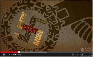
I also love the extreme cropping of the typography, it’s commanding like the speech and it really is done just the right amount.I like that the designer is not afraid to push the boundaries of the screen (0:38). After all the subject matter is all about pushing boundaries and doing something incredibly fearless and unconventional. There are parts that the type moves fairly fast because of the pace of the speech, so without sound, it may be difficult, but with the sound, you can follow it quite well.

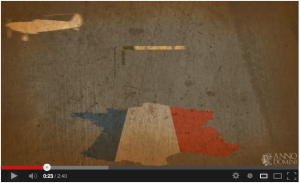
The planes is also something that I haven’t noticed as much in other kinetic type videos, but this one does some really interesting things with the maps and playing on depth of field using planes in his animation window. It really effective for giving the illusion that the viewer is moving with the troops through the story on their journey. It’s really brilliant (0:42).

Inglorious Basterds Kinetic Typography

Inglorious Basterds Kinetic Typography

Screen Shot 2013-02-11 at 9.39.30 PM

Screen Shot 2013-02-11 at 9.39.42 PM

Screen Shot 2013-02-11 at 9.39.59 PM

Screen Shot 2013-02-11 at 9.40.22 PM

Screen Shot 2013-02-11 at 9.40.46 PM

Screen Shot 2013-02-11 at 9.41.02 PM

Screen Shot 2013-02-11 at 9.41.40 PM

Screen Shot 2013-02-11 at 9.42.03 PM

Screen Shot 2013-02-11 at 9.43.29 PM

Screen Shot 2013-02-11 at 9.44.03 PM